Samsung Knox is an award-winning suite of B2B tools designed to empower IT administrators with the ability to secure data, manage large mobile fleets, and remotely deploy new technologies across devices. It offers a comprehensive solution for monitoring and controlling enterprise mobility, ensuring seamless and secure device management.
In this professional project, I led the reorganization and update of the platform’s visual assets and functional patterns to ensure brand consistency and enhance usability. My role involved aligning the platform with Samsung’s global brand guidelines, while also improving user experience for IT administrators managing complex workflows.
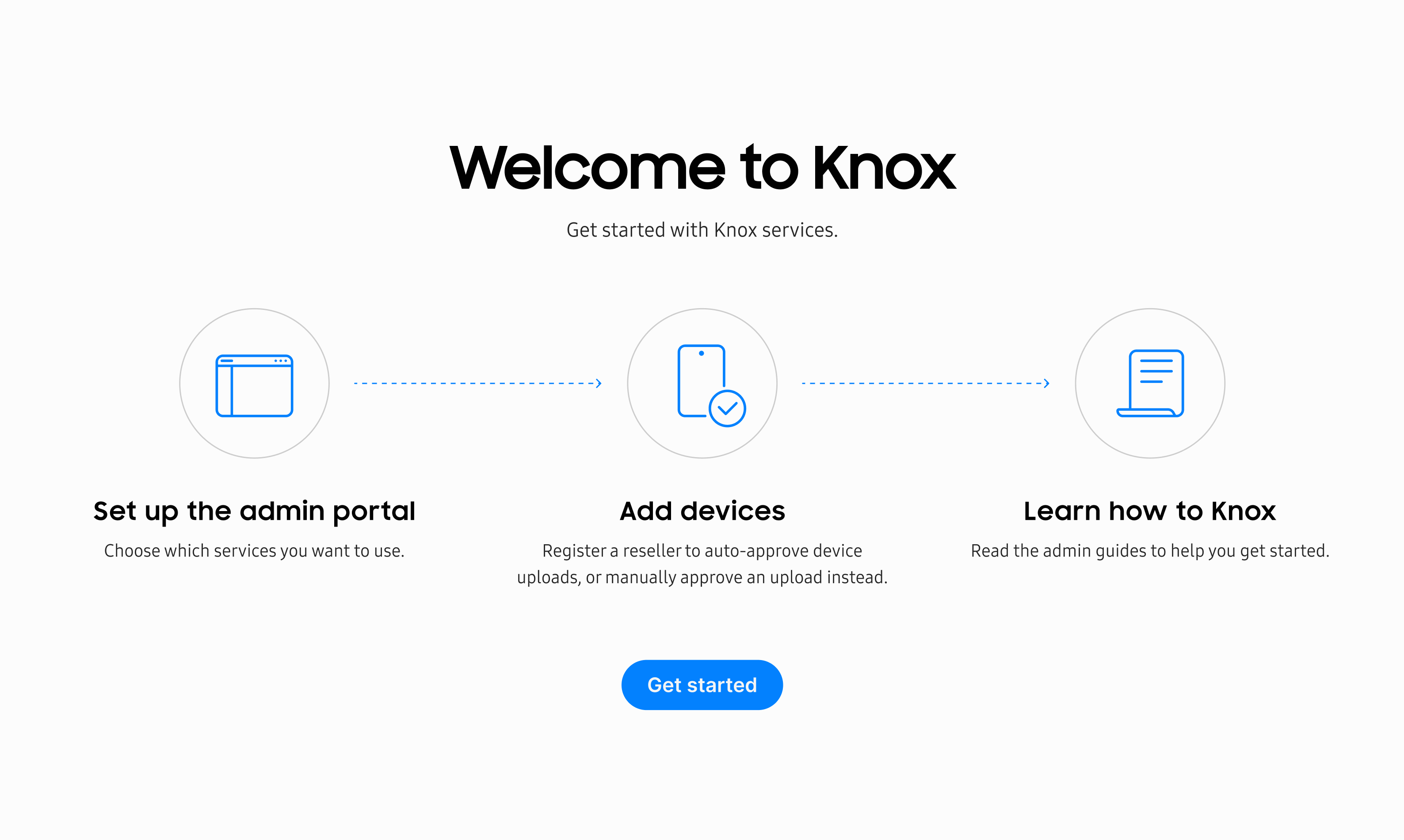
Upon being tasked with creating mockups for a new feature, I quickly encountered a common issue: The lack of reliable assets and guidelines. Instead, I was often directed to sift through numerous shared files or create my own components from scratch.
Despite having prior experience working with design systems, I refrained from immediately proposing one. I wanted to fully understand our team, or corporation's underlying problems, whether they stemmed from a missing component library or potential software limitations, to ensure any solution I proposed would address the root causes.
To understand the core issues faced by designers, developers, and product managers—such as handoff inefficiencies and time-to-market pressures—I conducted both qualitative and quantitative research with support from our research team.
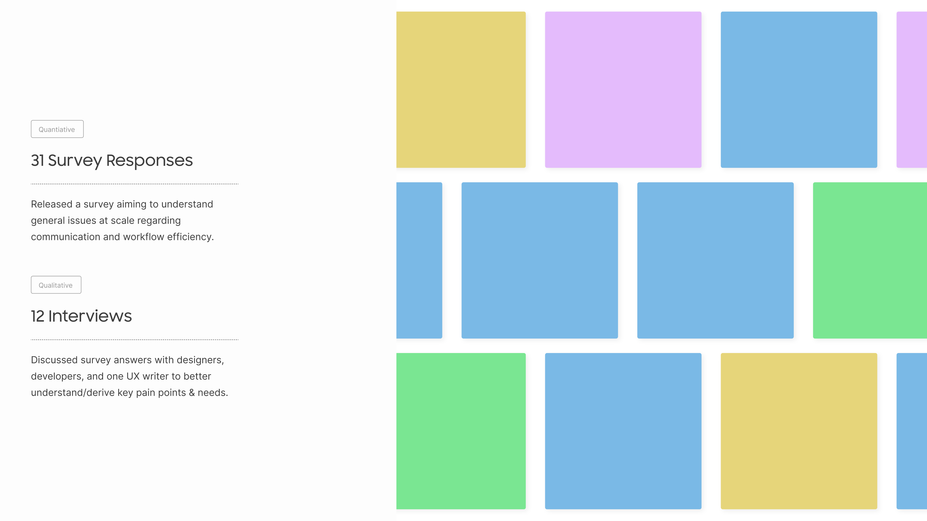
We gathered 31 survey responses and held 12 in-depth interviews with key stakeholders, including designers, developers, and UX writers. These discussions helped us pinpoint the critical pain points and needs, allowing us to better shape our approach to improving the design process.
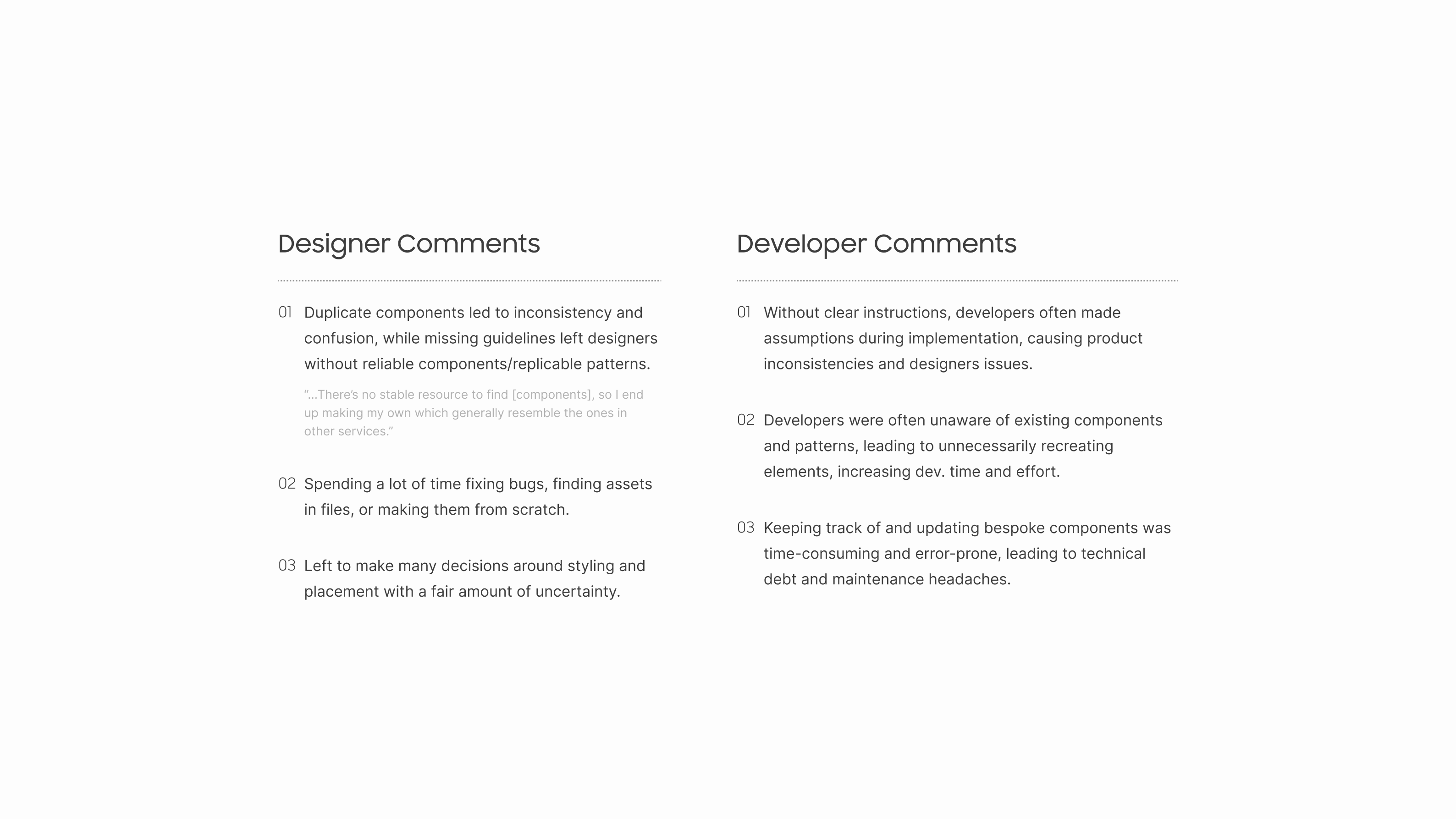
Designers struggled with inconsistency due to duplicate components and the absence of reliable guidelines. Many, including myself, resorted to creating bespoke components, which led to wasted time, confusion, and an inflated asset library. Additionally, they frequently made uncertain decisions about styling and placement without clear direction, further complicating their work.
For developers, the lack of clear instructions caused them to make assumptions during implementation, resulting in product inconsistencies and more work for designers. Many were unaware of existing components, leading to redundant work and increased development time. Managing and updating custom components was also error-prone, contributing to technical debt and maintenance challenges.
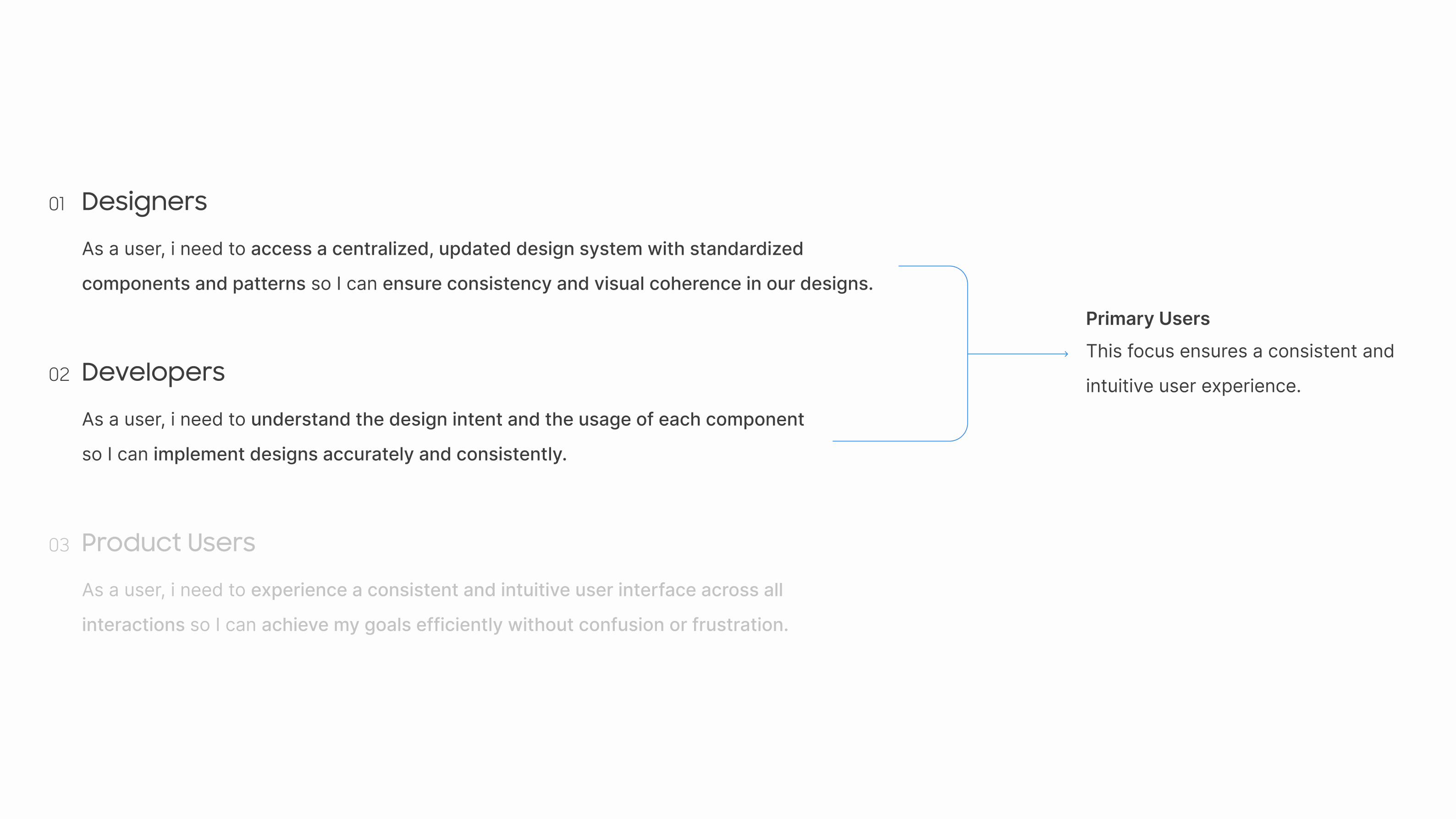
I identified designers and developers as the primary users to focus on, as they are responsible for creating and implementing features. By providing them with a comprehensive asset sheet and clear guidelines, we could ensure consistency in both component function and style across the platform. This approach would also streamline access to assets within design and development tools.
My assumption was that addressing these issues at the organizational level would lead to a more cohesive and intuitive user experience, ultimately reducing experience gaps and improving overall product satisfaction.
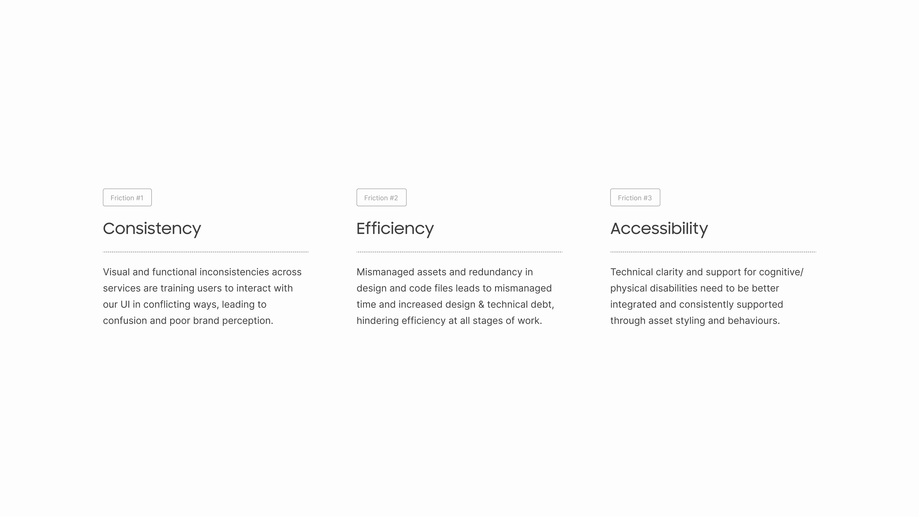
After reviewing the findings with my mentor, we identified three main pain points. First, disjointed experiences across services arose from a lack of standardization, forcing designers and developers to make individual style decisions, which led to inconsistencies and undermined brand confidence.
Second, redundant assets and classes cluttered our files, making it difficult to find components in Figma or code, increasing both design and technical debt, and leading to excessive rework due to misalignment.
Third, Finally, accessibility needs were overlooked, particularly for users with cognitive disabilities or those using assistive technologies. This impacted usability across the product and needed urgent attention to ensure all features were built with accessibility in mind.
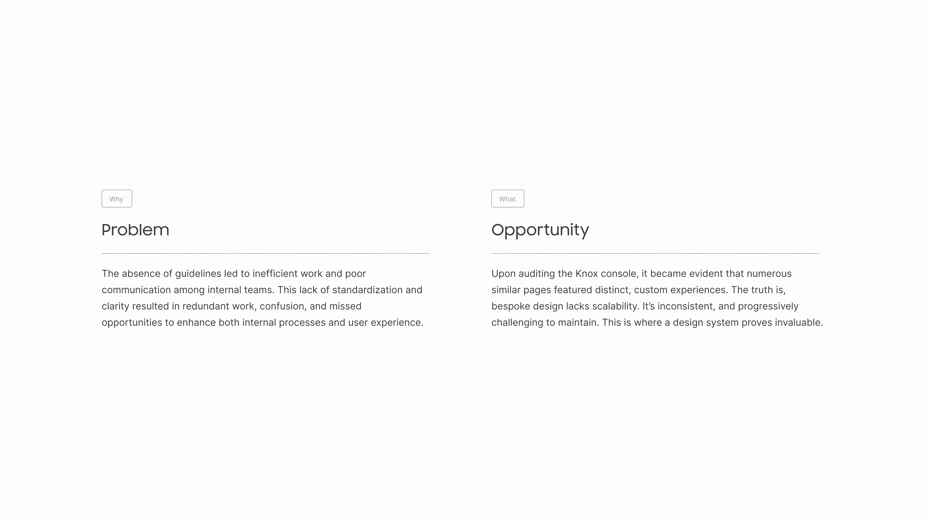
Problem: The lack of guidelines led to inefficiencies, redundant work, and confusion among teams, undermining both internal workflows and user experience.
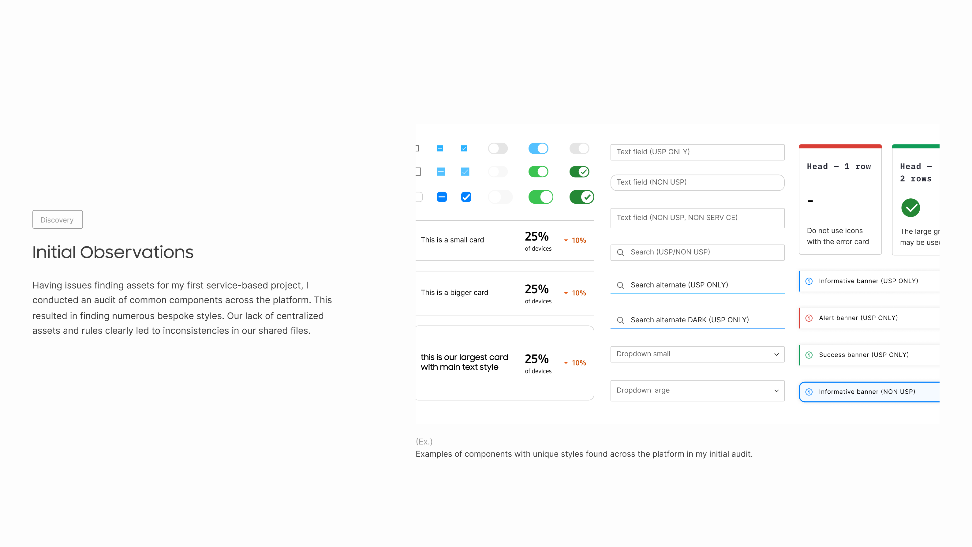
Opportunity: An audit of the Knox console showed that custom designs on similar pages created inconsistencies and were difficult to maintain. A design system would ensure scalability, consistency, and long-term efficiency.
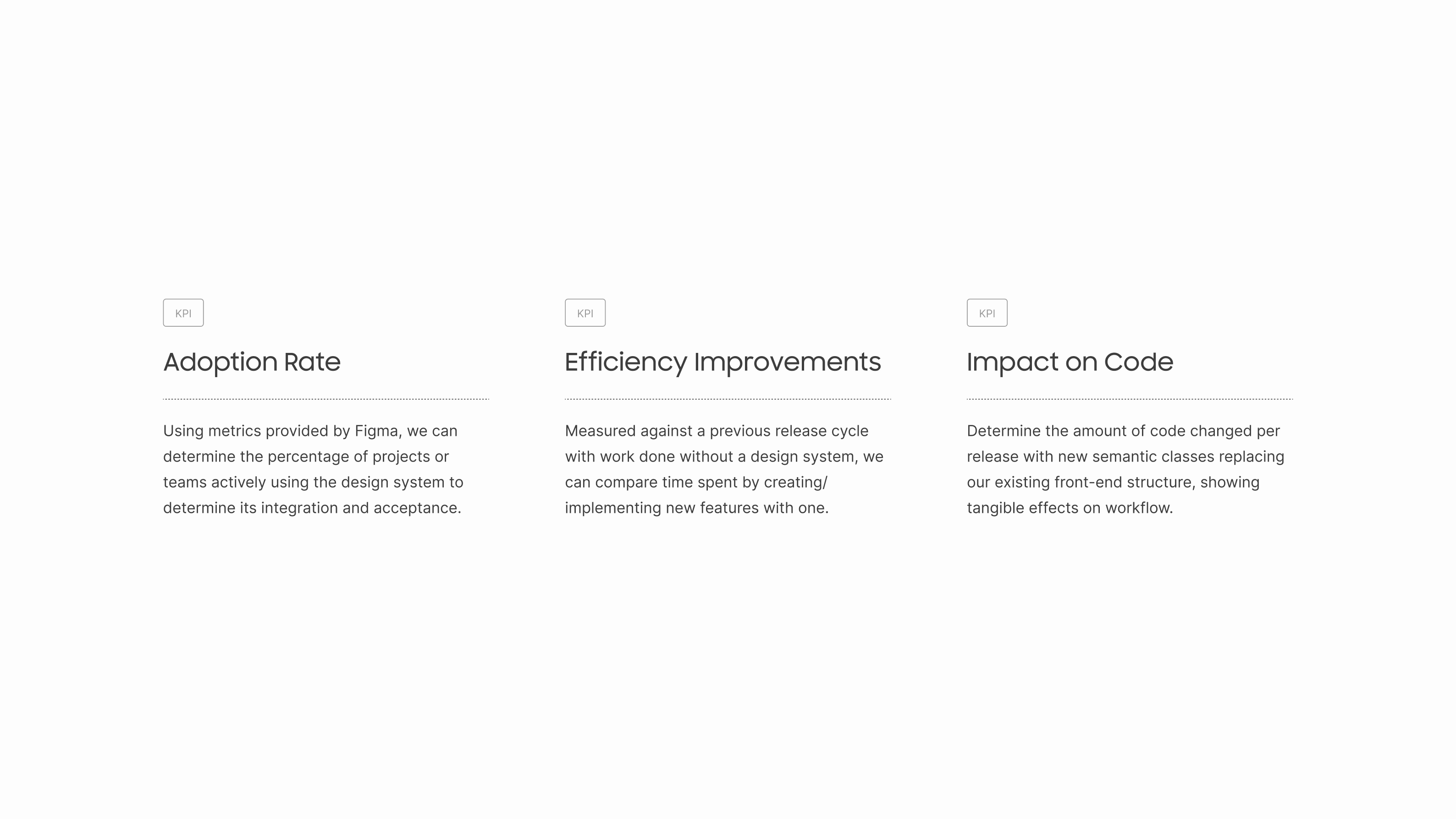
As I prepared to pitch my findings, I realized I had overlooked success metrics. This prompted me to develop KPIs with input from the dev and design teams to measure the impact of the design system.
I focused on key pre-implementation challenges, such as design inconsistencies, workflow inefficiencies, and communication gaps. I then aligned these with measurable outcomes like adoption rates, time saved, and error reduction. These KPIs would clearly show how well the system addressed our core issues and improved overall productivity and quality.
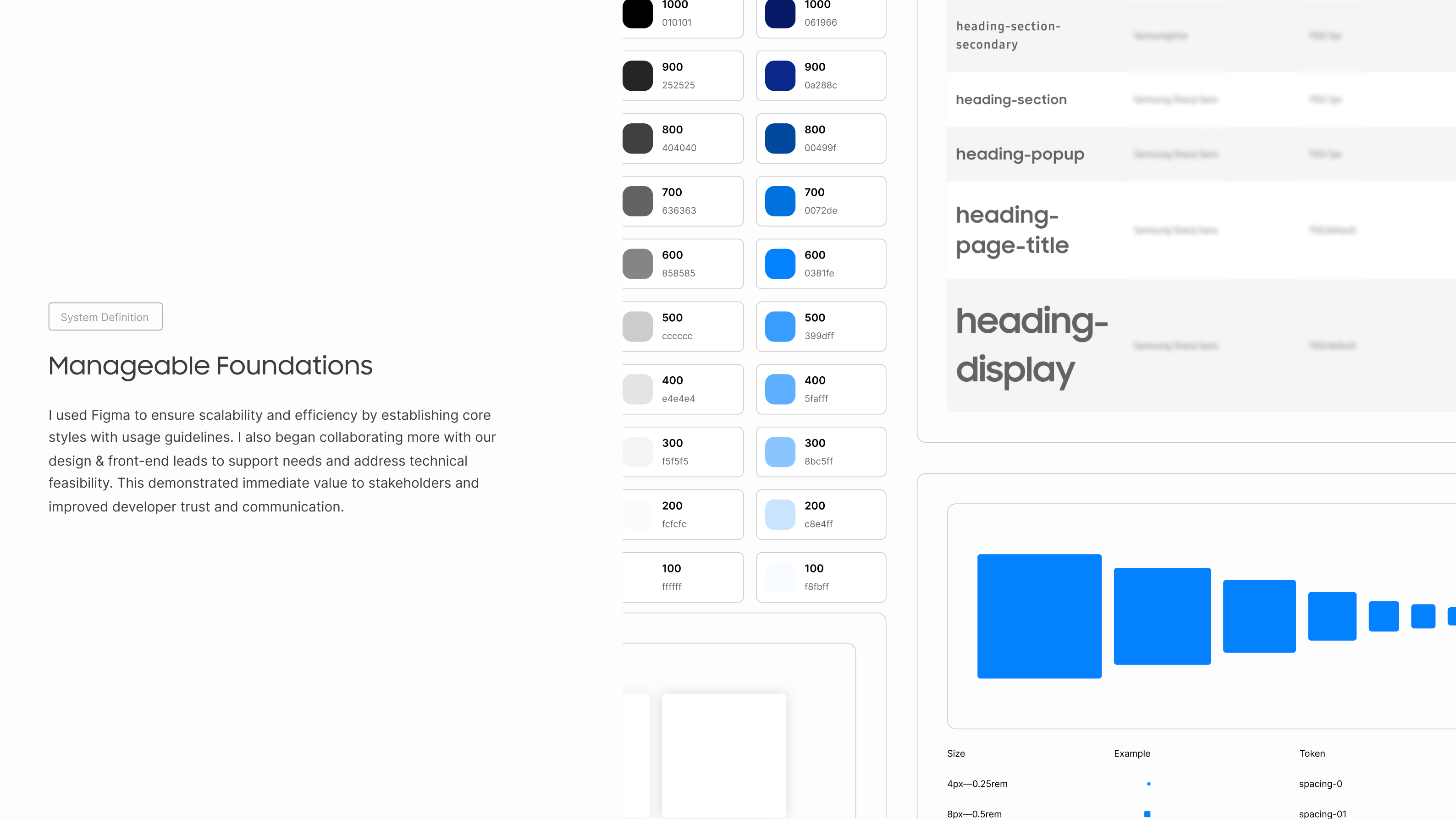
I began by building the foundational elements of the design system, such as colors and typography, to bring structure to our previously unorganized styles. Prioritizing scalability and efficiency, I leveraged Figma’s advanced features, such as variables and dev-mode, while collaborating with a front-end lead to ensure technical feasibility. This also addressed the development team’s need for inclusion throughout the process.
After auditing common styles, we established a clear set with descriptions of when to use them. This approach not only laid the groundwork for component development but also demonstrated immediate value to stakeholders and strengthened communication with developers, who had previously felt disconnected from the process.
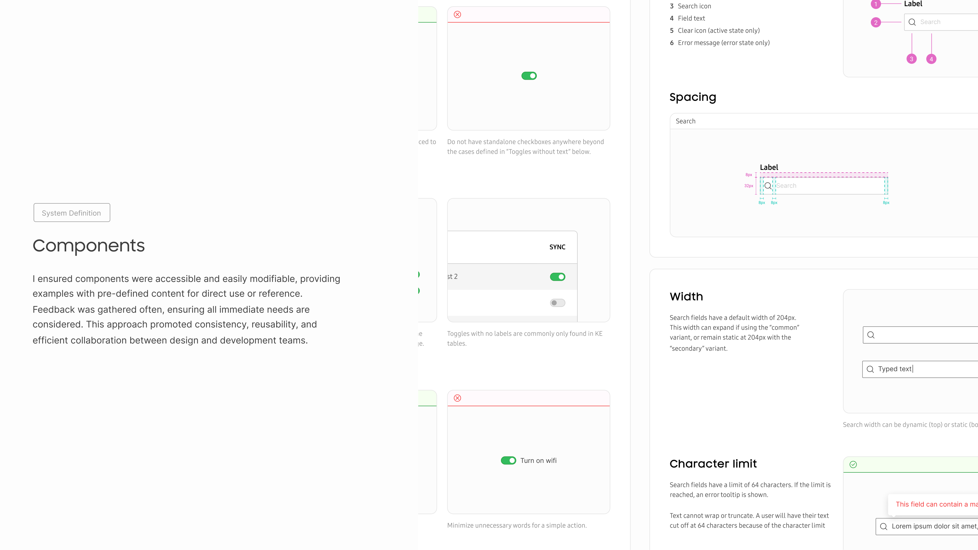
When developing components, I focused on meeting the needs of both designers and developers to ensure a seamless user experience. Based on the findings from our qualitative and quantitative research, I addressed key pain points like inconsistent design, inefficient workflows, and communication gaps. This helped guide the design of flexible, accessible components that could be easily modified and adapted across projects.
Each component was designed with scalability in mind, featuring pre-defined content and clear guidelines to ensure ease of use. This approach not only promoted consistency but also enhanced collaboration between teams, reducing rework and improving time to market. By aligning the components with the specific needs of our users—derived from research—I ensured the design system provided practical solutions, contributing to a more efficient and user-centered workflow.
Throughout the project, I would often recieve questions about what a feature is, or how to improve at using them. I took this as an opportunity to plan a series of learning sessions, where I would research and present features such as Variables that members were uncomfortable with using.
The transfer of knowledge plays a large role in my position, where it has allowed me to better connect with peers both within and beyond my team. It also ensures the long-term maintenance of the system, where other designers without prior design system domain knowledge are now positioned to be confident with the domain, and its associated tools—prompting continued buy-in from our stakeholders.
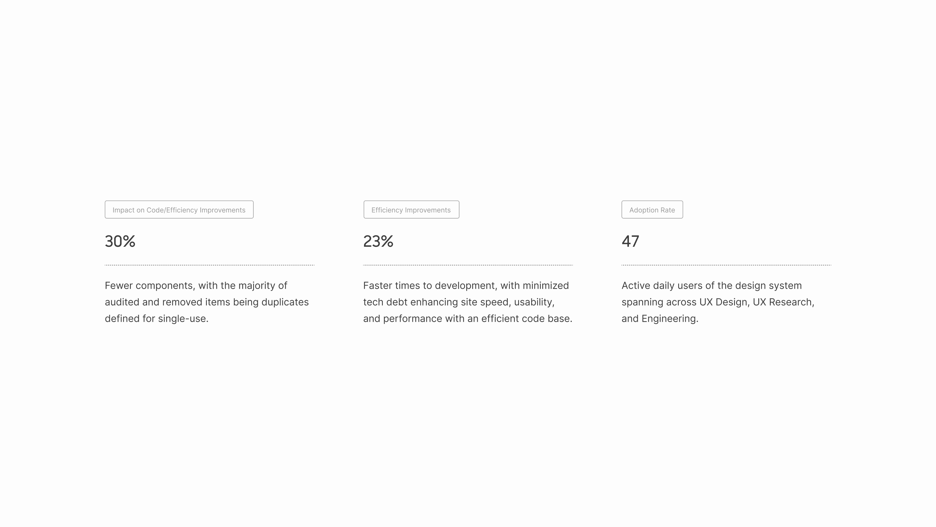
Since implementing the design system, we’ve seen a 30% reduction in components by eliminating redundancies and simplifying our design structure. This was tracked through the initial audit and led to faster implementation times for features prioritized by PMs.
Another key result is the improvement in time to implementation, as teams can now move more quickly from the moment a PM prioritizes a feature. By cutting design and development overhead, we've freed up time for designers and developers to focus on crafting user experiences rather than spending it searching for or recreating assets.
Figma’s metrics have also shown a strong adoption rate across teams, which highlights the cross-functional collaboration fostered by the design system. This level of adoption supports our broader goals of scalability and consistency across the Knox console. Each of these outcomes is tied back to the KPIs we set, ensuring that the system is addressing core issues such as inefficiency, inconsistency, and communication breakdowns, all while contributing to improved overall productivity.
Before anything else, I appreciate you taking the time to read through my (hours of) writing.
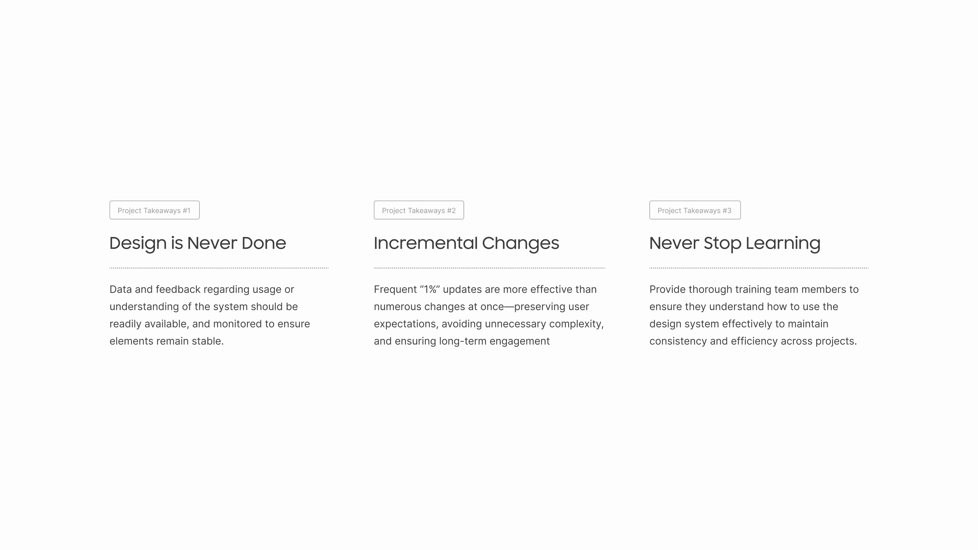
One of my key learnings is that work doesn’t end once a design system goes live; it's crucial to continuously monitor data and feedback to keep things stable and effective. I realized that making small, frequent improvements based on actual needs can have a greater impact at scale without disrupting workflows. Lastly, I’ve gained a deeper appreciation for the importance of continuous learning and knowledge sharing to ensure consistency and keep teams engaged throughout the process.